Field guide · 05
Palette
The ten colors most often cited for Cyberparadism, what each one is for, and how the site itself uses them.
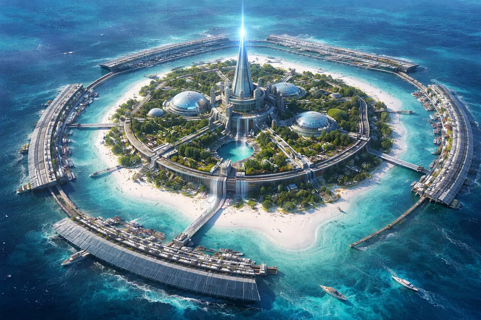
A frequently cited Cyberparadism palette emphasizes saturated aquas and greens with high-contrast neutrals and a single vivid accent. Creators treat it as a guideline rather than a constraint: aquas and greens communicate water, canopy and coastal brightness; silvers and whites communicate precision and cleanliness; the accent introduces signal, such as an alert, a highlight or a brand mark.
- Teal#008080Primary accent. Deep water, shade under canopy, links and emphasis on light surfaces.
- Aquamarine#7FFFD4Shallow lagoon light. Highlights, selections, links on dark surfaces.
- Jungle Green#29AB87Canopy and living systems. Secondary accent, active states, markers.
- Turquoise#40E0D0Mid-water. Gradients between teal and aquamarine, hover states.
- Cyan#00FFFFPure signal light. Interface glow and holographic cues. Use sparingly.
- Folly#FF004FThe single vivid accent. Alerts, a lone flower, a warning light. Never more than one per scene.
- Silver#C0C0C0Machined metal and hairlines.
- Platinum#E5E4E2Ceramic surfaces, pale concrete, the ground of a light interface.
- Charcoal#333333Ink, shadow, the ground of a dark interface.
- White#FFFFFFGlare, cloud, blank material.
Proportions
A scene that follows the palette tends to divide roughly like this:
| Share | Colors | Role |
|---|---|---|
| Most of the frame | Jungle green, teal, turquoise, white | Canopy, water, sky, haze |
| The enclave | Platinum, silver, white | Ceramic, glass, pale stone |
| Shadow and depth | Charcoal, teal | Shade under canopy, deep water |
| Signal | Aquamarine, cyan | Interface light, glow from within glass |
| One accent | Folly | A flower, a flag, a warning light, never two |
Folly is the easiest color to overuse. One occurrence reads as deliberate; several read as a theme park.
Materials
Colors arrive attached to materials. Platinum is ceramic and bright concrete. Silver is machined metal, used thinly: rails, seams, the edge of a platform. White is cloud, glare and blank composite. Teal and turquoise are water seen at two depths. Jungle green is foliage, rarely paint. Charcoal is shadow first and material second.
On this site
The interface you are reading uses the same palette. The day theme sets charcoal ink on a platinum ground with teal as the link color. The night theme sets platinum ink on a deep charcoal ground with aquamarine as the link color. Jungle green marks the active navigation item, and folly is held in reserve for warnings. Every text and background pair is checked for a contrast ratio of at least 4.5 to 1, which is why the teal used for links on light surfaces is a shade darker than the swatch above; pure teal on platinum sits just below the threshold.